18 Jul 2022
Featured of the Day
Fig
byHerman-Scheer
from United States Categories Food, Health, Lifestyle, App Colours Black Green WhiteMore Info
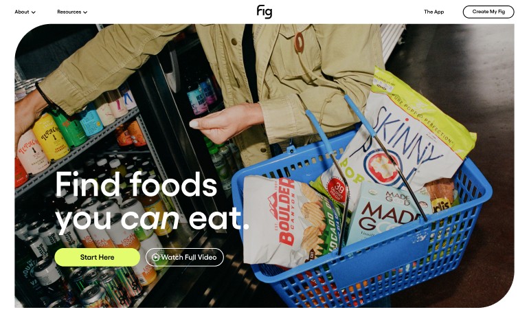
In partnership with Herman-Scheer, a branding and design studio based in Venice, CA, Fig launched the app that instantly shows you what food you can eat based on your needs, so you can spend fewer hours researching food and more time enjoying it! Fig stands for Food Is Good. It also stands for helping people with dietary restrictions everywhere. Food is good. And Fig is for you. Fig is an app that helps people with dietary restrictions find foods that work for them. We wanted to amplify their mission of making life easier with a welcoming brand identity and a simple, efficient digital presence that captures the humanity and delight of eating. How do you compile thousands of ingredient lists, products, community stories, and medical professionals in a way that doesn’t seem daunting to the user? With clear and concise design and messaging that expedites the user’s journey. Mundane, tedious, restrictive, and a lack of spontaneity—that’s how people describe living with dietary restrictions. So we chose an inviting typeface, comforting colors that still spring and pop, and a unique icon shape that lives outside of the norm. Paired with accessible lifestyle imagery, we showcased the one ingredient that everyone wants: joy. The most important features of the app are its functionality and community. We dialed in on comfortable user experience details, educating while displaying its ease over our Fig-shaped icon. And embracing the community behind a movement for ingredient transparency with friendly faces front and center, because breaking bread doesn’t exist without the nourishment of the human element.


