More Info
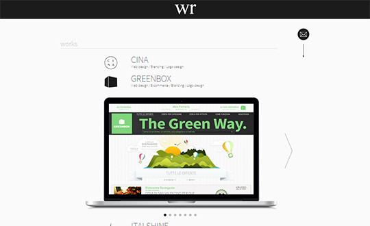
We designed our website using just black and white, to let users focus on galleries, the only colored elements. The idea beneath the project was to give the feeling of entering a white room without showing one, hiding the main page under a black panel that opens up on the language choice. Titles of works and services become light grey on hover, slowly and softly; even panels open up gently, never too fast. Clicking on the logo makes the header panel slide down, showing the hidden words that represent our vision: we put no indication of this on purpose, a subtle way to say 'Just for the few'. In conclusion, this is a really simple website, that tries to express the qualities and the vision of the agency in a clean and unaggressive way.


